Greens for South Facing Rooms
Popular Green Paint Colours

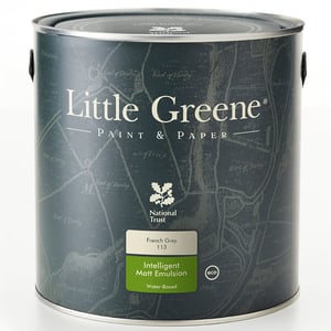
Little Greene Pea Green

Dulux Trade Tranquil Dawn

Crown Trade Box Tree

Johnstone's Trade Olive Sprig
Colours To Pair With Greens
When decorating with green, choosing the right complementary colours can elevate your space and tie the look together beautifully. Whether you're opting for a soft sage or a bold forest green, pairing it with the right tones will bring balance and character to your south-facing room. Here are some tried-and-tested combinations to consider:
Whites
A timeless and clean pairing, white and green is a classic combination that always works. Adding a crisp white to woodwork, skirting boards, doors, or ceilings helps to define the green and give the room a fresh, finished feel. Opt for cooler whites with green undertones to maintain a cohesive palette, or go warmer if your green has olive or earthy notes. This combo is especially effective in south-facing rooms where sunlight can make whites feel even brighter and more uplifting.
Pink
Soft blush tones, dusty rose, and peachy pinks can bring a gentle contrast to your green walls without feeling too sweet. For a stylish, contemporary twist, pair sage or mint green with pale pink furnishings or textiles — think linen curtains, scatter cushions, or even wall art. It’s a subtle nod to millennial interiors but done with a grown-up elegance that feels fresh rather than overdone.
Magnolia
These soft, buttery off-whites add a gentle warmth to your space and work especially well with green tones that have yellow or grey undertones. Using magnolia alongside green helps to soften the contrast and create a soothing, cohesive scheme. Try pairing green walls with a cream sofa, neutral drapes, or even a traditional fireplace for a look that’s equal parts comforting and refined. It’s an ideal pairing for more classic interiors or for those leaning towards a modern country aesthetic.
@thepaintshed Find your perfect green paint colour for south-facing rooms #southfacing #southfacingroom #green #colourinspiration #greenpaint #greenpaintcolours #greenhomedecor #greenaesthetic #paintinganddecorating #decoratingideas #diy #interiordesign ♬ Ok I Like It - Milky Chance


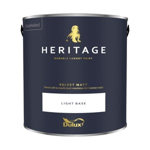
Dulux Heritage Pearl is a pale, pistachio green paint colour with a slightly yellow undertone. This shade will create a light, crisp feeling in any room.

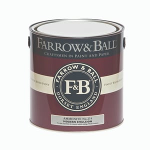
Farrow & Ball Vert De Terre is a soft, muted green with a hint of grey. This calming shade works well in any room.