The Power of Pastels: How to Use Soft Shades in Your Home
Popular Pastel Paint Colours

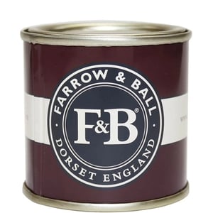
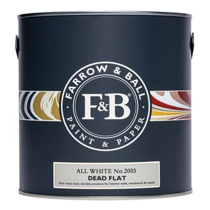
Farrow and Ball Borrowed Light

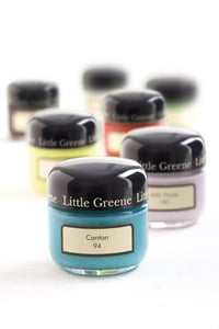
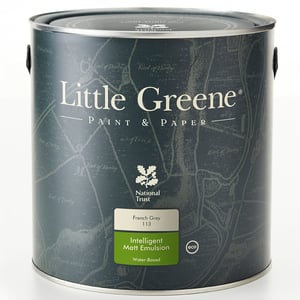
Little Greene Chemise

Paint and Paper Library Sprig III

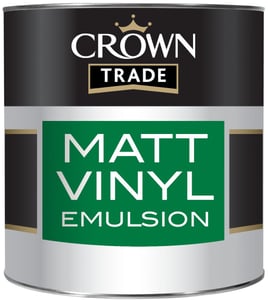
Crown Trade Lemon Balm

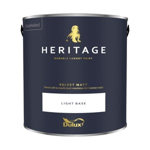
Dulux Heritage Lavendar Grey

Johnstone's Trade Pastel Paper
Where to Use Pastel Colours
Living Room
A soft pastel feature wall or subtle all-over colour can create a warm and inviting space. Pair with natural textures, such as wood and linen, for a balanced, cosy feel.
Bedroom
Pastels are perfect for bedrooms, promoting relaxation and restful sleep. Try dusky pink, soft lilac, or powder blue for a dreamy retreat.
Children’s Rooms
Pastel shades are a great alternative to bright primary colours in kids' bedrooms and nurseries. They offer a playful yet calming atmosphere.
Garden Furniture
Pastel shades are a great alternative to classic mahogany or oak wood colours in the garden. Using pastel colours outside is a simple way to add a pop of subtle colour to complement your plants and flowers or to add vibrancy in place of colourful blooms.


Little Greene Dorchester Pink is a classic pastel pink shade. Use it on front doors and garden furniture or bring it indoors for a calming bedroom or living room.

Dulux Heritage Copenhagen Blue is a pale blue that works well in any space, particularly south-facing rooms where it will bask in natural light.

Dulux Heritage Lavendar Grey is a subtle lavendar blue shade that creates a serene, calming space wherever it is used.